Art prints retro searches usually come from buyers who want color, nostalgia, and graphic personality without committing to a formal painting. Retro prints suit apartments, creative offices, music rooms, and gallery walls. The limitation is depth: a print may give the room style quickly, but it may not provide the same surface presence as an original painting.
The smart choice is not print versus painting in a generic sense. It is about what the room needs: flat graphic impact, layered texture, a nostalgic palette, or a more collected feeling.
What retro art prints usually do well
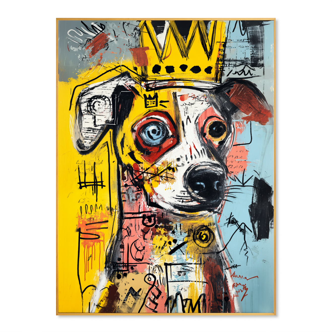
Retro prints are strong when a room needs an immediate graphic signal. They can introduce 1960s curves, 1970s color, music-poster energy, mid-century geometry, or pop-art references. Because prints are flat and repeatable, they work well in sets, rental apartments, and casual gallery walls.
They also make it easier to test a palette. Mustard, coral, teal, chocolate brown, cream, and black can shift the atmosphere of a room without replacing furniture.
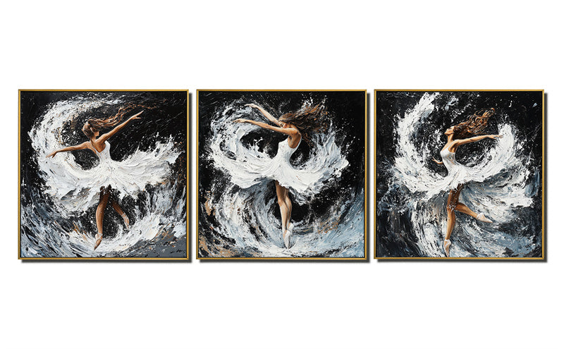
Where original paintings change the effect
Original paintings bring variation that a print does not try to provide. Brushwork, edge irregularity, texture, and subtle color shifts can make a retro-inspired room feel less like a themed set. This matters in interiors where the buyer wants nostalgia but not costume design.
For IrisLee Gallery, colorful, pop-inspired, abstract, or figurative works can be considered when a buyer likes retro energy but wants a hand-painted surface instead of a printed poster effect.
How to choose retro color without dating the room
Retro color works best when it is edited. One strong accent color can feel intentional; five saturated colors can feel chaotic unless the furniture is very simple. If the room already has warm wood, a print or painting with ochre, rust, or olive may integrate more naturally than a neon palette.
For cooler rooms, teal, blue, black, ivory, and pink can keep the retro mood fresh rather than heavy.
Print, canvas, or painting
A paper print is usually crisp and easy to frame. A printed canvas can feel more substantial from a distance, though it remains a reproduction. A hand-painted canvas introduces surface and individual variation. None of these is automatically wrong; the difference is how much physical presence the wall needs.
A narrow hallway may only need a framed print. A large living room wall may benefit from a larger canvas or original work because the surface has to hold more visual weight.
Mistakes with retro wall art
The biggest mistake is using retro art as a shortcut for personality while ignoring scale. A small print on a large wall can feel temporary. Another mistake is repeating too many nostalgic objects in one room: retro art, retro lamp, retro rug, retro typography, and vintage furniture can become overly literal.
Let the artwork carry the memory, then keep the rest of the room balanced.
A practical comparison checklist
- Choose a print if you want crisp graphics, low commitment, or a gallery wall set.
- Choose a canvas if the wall needs more size and presence.
- Choose an original painting if texture, variation, and a collected feeling matter.
- Avoid matching every color in the art to the room; one or two repeated notes are enough.
Frequently Asked Questions
Are retro art prints still stylish?
Yes, retro art prints can still feel stylish when the palette is edited and the room avoids heavy theme styling. The artwork should feel like a chosen accent, not a costume for the whole interior.
Should I choose a print or an original painting?
Choose a print for graphic clarity and flexibility, and choose an original painting when the room needs texture, depth, and a more collected feeling.
What rooms suit retro art prints?
Retro art prints work well in apartments, studios, offices, music rooms, and casual living spaces. They are strongest where color and personality are welcome.